Guided by André Baldinger at École Nationale Superieure des Arts Decoratifs, Paris, during Exchange Semester 2018.
Ira is a modern display serif typeface that brings together high contrast of strokes along with decorative drop-like elements to give the sense of elegance and beauty. Made over a span of four months, the process involved sketching of letterforms inspired by droplets of water before moving on to digital mediums for further correction.
TYPE DESIGN | ART DIRECTION
Ira
Guided by Ruedi Baur, Vera Baur and Pauline Marchetti at École Nationale Superieure des Arts Decoratifs, Paris, during Exchange Semester 2018.
Words from a language often have completely different meanings in other languages which paved the way for this project of false friends. These cards accompanied with interesting illustrations give a unique insight to the meanings and scripts of languages around the world. The card could be used by language enthusiasts as collectibles, conversation-starters or even to teach children about the diversity in the world.
ILLUSTRATION | ART DIRECTION
False Friends
THE VISUAL POLICE
System Design | Identity Design
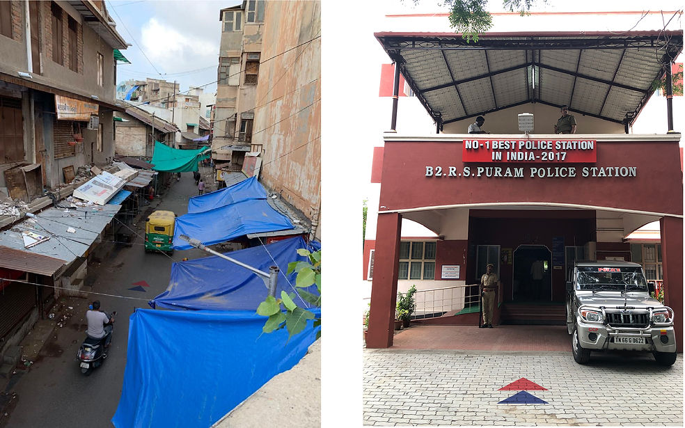
India has an alarmingly low police-to-people ratio with around 144 officers for every 100,000 people. With a rising population and dwindling resources, India calls for strategic solutions that could increase police presence without any increase in personnel. This research-intense project started off as an in-depth study into the system of the Ahmedabad City Police, with site visits, interviews and readings but later developed as a strategy that could enhance the falling sense of security. The project is called so, as it explores various visual ways to compliment the existing police officers level to improve the overall presence of an authority figure in the city. It employs the use of symbols in different ways to address the fundamental problems that arise between police and public.
Design Question:
How can one create a presence of authority in a city with dwindling resources?
Duration:
6 weeks
Guided by Jonak Das at the National Institute of Design, Ahmedabad during late 2019.
Picture Credits: Shreya Parasrampuria

The name of the visual campaign 'Aapnu Police' is Gujarathi for 'Our Police'


Current visual strategies of police are quite passive.

Manipulation of the existing symbol into active icons that could participate in the various design interventions mentioned hereafter.

Design Intervention 01
Location markers painted around the city in regular intervals always point to the closest police station. These symbols painted on public walls and roads give an assurance to citizens of police presence and their location. Here the identity is used as direction markers that guide people by pointing them on where to go.


Design Intervention 02
Hand painted signs emphasising the police helpline number especially in areas considered unsafe and dangerous. This is to also create channels of communication for preventive actions.

Design Intervention 03
To bring transparency into the functioning of the police and their activities, indicators of crime could be useful for making results more palpable to the city. This could also encourage a healthy competition between police stations. Here the same identity works as indicators that reflect the trends in crime.


Design Intervention 04
To bring to public view the positive interactions between the people and the police, and to also highlight stories that encourage and bring out the best is police-public collaboration, stories could be made available to read at waiting areas. Here the identity works as quotation marks to encapsulate encouraging words.

Future Extensions:
The identity has also possibility to translate over websites and other digital platforms where the police interact with the public, Something that could also bring palpability is patrol routes of the police at night and access to covert teams in the city that work to prevent crime.