Guided by André Baldinger at École Nationale Superieure des Arts Decoratifs, Paris, during Exchange Semester 2018.
Ira is a modern display serif typeface that brings together high contrast of strokes along with decorative drop-like elements to give the sense of elegance and beauty. Made over a span of four months, the process involved sketching of letterforms inspired by droplets of water before moving on to digital mediums for further correction.
TYPE DESIGN | ART DIRECTION
Ira
Guided by Ruedi Baur, Vera Baur and Pauline Marchetti at École Nationale Superieure des Arts Decoratifs, Paris, during Exchange Semester 2018.
Words from a language often have completely different meanings in other languages which paved the way for this project of false friends. These cards accompanied with interesting illustrations give a unique insight to the meanings and scripts of languages around the world. The card could be used by language enthusiasts as collectibles, conversation-starters or even to teach children about the diversity in the world.
ILLUSTRATION | ART DIRECTION
False Friends
TUNE
Data Visualisation
Tune is a project aiming to plot the dynamics between music and its listeners. The National Institute of Design is a diverse college bringing in students from different parts of the country and from different cultural backgrounds who listen to music almost continuously through the day. Completed over a week as part of an assignment, this group project involved collecting information, exploring suitable representational forms and finally creating a mapping where one is able to make connections and discoveries. We explored songs and genres people listened to, their moods, the spaces and their activities at that time to create two interactive visualisations each with its own purpose.
Guided by Dr Jignesh Khakkar and Prachi Nagpal at the National Institute of Design, Ahmedabad during late 2019.
Design Question:
How can we synthesise data and create something that becomes a place for information and discovery?
Duration: 8 weeks
Rest of Project Team:
Manasa Krishnan
Sanjana Vamadevan
Stuti Sukhani
Videet Desai.


Looking at interview questions through the lens of visual queries—what is the story?


Explorations of visual representations went through a series of discussions
The 4-Axis Graph Representation:
This representation looks at the first inquiry. To see connections between the different parameters, we created a four-point plot graph with parameters on each side and colours to match genres. Each quadrilateral represents a single respondent and their data. Preference over music or lyrics has been encoded in the line itself with the song lyrics written in the case of the latter. This interactive chart is a method to isolate parameters to notice behaviours to infer a larger trend.
In the chart, only the genres are interactive. Click on any of the ones below it to isolate and notice trends. Note that the visualisations are originally intended for print.
To view the chart in full screen click here.

Close-up
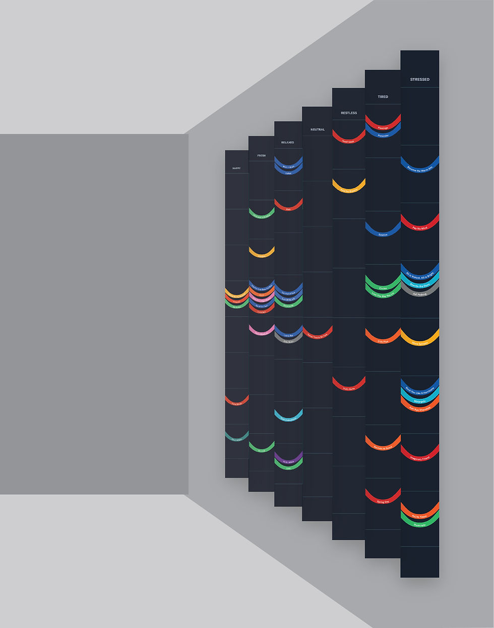
Accordion Fold Representation:
The second representation looked at making this data collected accessible to everyone by reducing number of parameters. Moods were marked on one side while spaces were marked on the other. Colour denoted the genres of the songs. Time was divided into two—morning (6am—6pm) and evening (6pm—6am). Though this was plotted visually with the use of the upper or lower waves, we used viewpoint as another parameter. By creating an accordion fold, one can see all the morning songs from one position and the evening songs in another.
In the representation below, click on the icons in the view menu to toggle between different views. Since the visualisation was intended for print, the sizes have been scaled down for digital viewing.
To view the chart in full screen click here.


Close-up
