Guided by André Baldinger at École Nationale Superieure des Arts Decoratifs, Paris, during Exchange Semester 2018.
Ira is a modern display serif typeface that brings together high contrast of strokes along with decorative drop-like elements to give the sense of elegance and beauty. Made over a span of four months, the process involved sketching of letterforms inspired by droplets of water before moving on to digital mediums for further correction.
TYPE DESIGN | ART DIRECTION
Ira
Guided by Ruedi Baur, Vera Baur and Pauline Marchetti at École Nationale Superieure des Arts Decoratifs, Paris, during Exchange Semester 2018.
Words from a language often have completely different meanings in other languages which paved the way for this project of false friends. These cards accompanied with interesting illustrations give a unique insight to the meanings and scripts of languages around the world. The card could be used by language enthusiasts as collectibles, conversation-starters or even to teach children about the diversity in the world.
ILLUSTRATION | ART DIRECTION
False Friends
FALSE FRIENDS
Illustration | Card Design
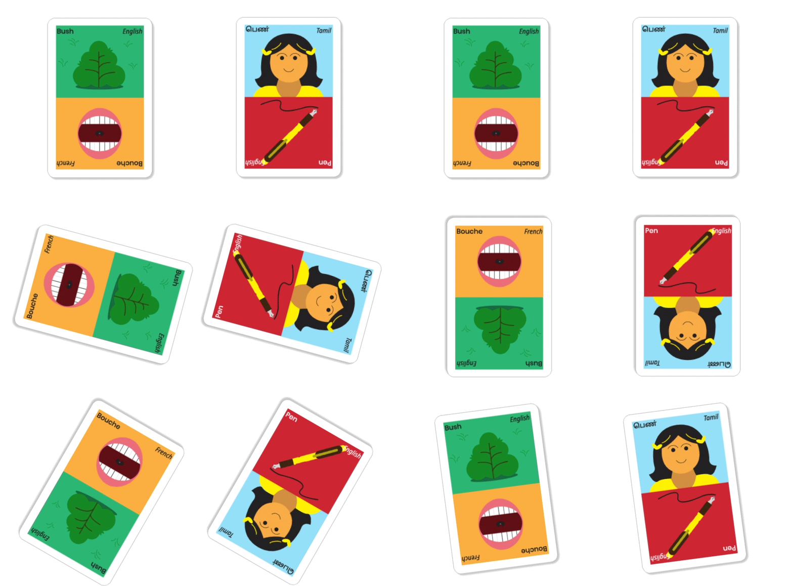
False Friends are words that sound almost the same but mean completely different things in different languages. I was inspired to work with them as they often offered funny juxtapositions. To celebrate the similarities and differences between different language groups, I decided to make a set of illustrated cards. These aim to give a unique insight into the meanings and scripts of languages around the world. Most people do not get a chance to interact with, much less even come across many other cultures in their lives. With cities going through an influx of immigrants from different parts of the world, these cards could be a small step towards bringing people together. They could be used by language enthusiasts as conversation-starters or even to teach children about the diversity in the world, which slowly seems to be the need of the hour.
Design Question:
How can one use language and play to encourage people to learn from each other?
Duration: 4 week
Guided by Ruedi Baur, Vera Baur and Pauline Marchetti at École Nationale Superieure des Arts Decoratifs, Paris, during Exchange Semester 2018.


Play is an important aspect of learning with these cards. These juxtapositions are often humorous as seen with 'Gift' in English and 'Gift' in German which translates to 'poison'
Another aspect is an insight into scripts. In the case of non-Latin languages, the cards also give insight into the scripts, such as Tamil shown above.
