Guided by André Baldinger at École Nationale Superieure des Arts Decoratifs, Paris, during Exchange Semester 2018.
Ira is a modern display serif typeface that brings together high contrast of strokes along with decorative drop-like elements to give the sense of elegance and beauty. Made over a span of four months, the process involved sketching of letterforms inspired by droplets of water before moving on to digital mediums for further correction.
TYPE DESIGN | ART DIRECTION
Ira
Guided by Ruedi Baur, Vera Baur and Pauline Marchetti at École Nationale Superieure des Arts Decoratifs, Paris, during Exchange Semester 2018.
Words from a language often have completely different meanings in other languages which paved the way for this project of false friends. These cards accompanied with interesting illustrations give a unique insight to the meanings and scripts of languages around the world. The card could be used by language enthusiasts as collectibles, conversation-starters or even to teach children about the diversity in the world.
ILLUSTRATION | ART DIRECTION
False Friends
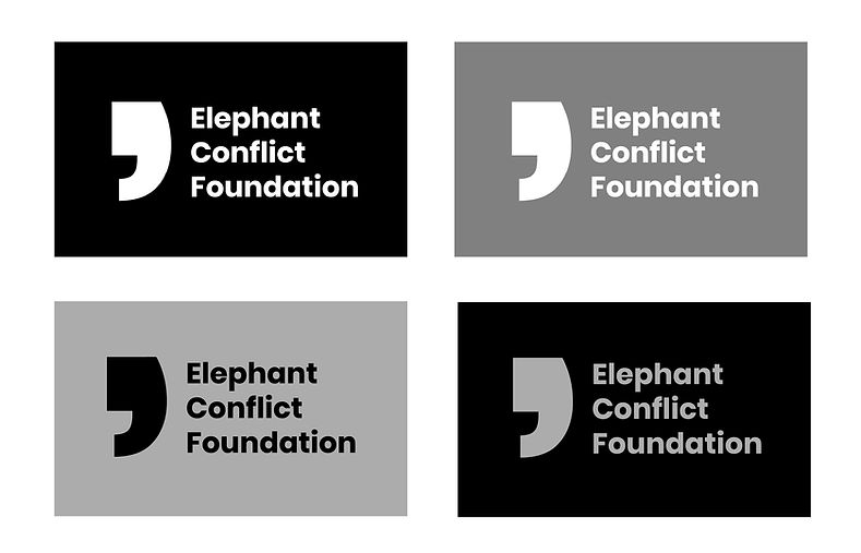
ELEPHANT CONFLICT FOUNDATION
Identity Design | Motion Graphics
The project started with an inquiry into the rising problem of man- animal conflict. The research-led project that included interviews with forest officials led me to create a hypothetical organisation called the Elephant Conflict Foundation. This organisation would, with the help of volunteers, create and deploy short term and long term solutions for the problem. It would inform and educate people on various causes of the issue and possible directions for its solution. To bring people from a myriad of backgrounds, a 2 minute awareness video that gives a basic understanding of the conflict was created. Along with the design of the identity of the organisation, a website was designed along with a possible direction into the social media.
Guided by Dr Tridha Gajjar at the National Institute of Design, Ahmedabad, 2019 and completed in four weeks.
Design Question:
How can one create awareness and a call-to-action for the urban people about a rising problem?
Duration: 4 weeks
Special thanks to Biplab Hazra for the pictures. Images of conflict presented are not owned by me and only used for educational purposes.


The organisation needed an identity that was designed combining the idea of a comma (a pause) and an elephant. The greyscale is an important part of the identity as well; one one hand is reminiscent of the elephant but also visually describes the grey situation.

Awareness video for the issue.
This video was made after careful synthesis of information obtained from statistics and interviews to create a cohesive informational video with a call-to-action.


Stills from the video.


Stills from the awareness video.

The website was designed keeping in mind the clean clarity required while dealing with the topic. The landing page gives an immediate statistic of the number of elephants in danger. A scroll leads one to know more about the Foundation.


The 'Learn' Section is where one can view the awareness video as well as educate themselves on the issue and its solutions.

In the 'Volunteer' tab has details where one can put in their details and be allotted a volunteer job based on their interest and preferred time period.
