Guided by André Baldinger at École Nationale Superieure des Arts Decoratifs, Paris, during Exchange Semester 2018.
Ira is a modern display serif typeface that brings together high contrast of strokes along with decorative drop-like elements to give the sense of elegance and beauty. Made over a span of four months, the process involved sketching of letterforms inspired by droplets of water before moving on to digital mediums for further correction.
TYPE DESIGN | ART DIRECTION
Ira
Guided by Ruedi Baur, Vera Baur and Pauline Marchetti at École Nationale Superieure des Arts Decoratifs, Paris, during Exchange Semester 2018.
Words from a language often have completely different meanings in other languages which paved the way for this project of false friends. These cards accompanied with interesting illustrations give a unique insight to the meanings and scripts of languages around the world. The card could be used by language enthusiasts as collectibles, conversation-starters or even to teach children about the diversity in the world.
ILLUSTRATION | ART DIRECTION
False Friends
AMAZON AQUILA
Environmental Graphics
The project involved creating environmental graphics for Amazon’s office building Aquila in Bangalore, India. The brief was to create meaningful wall graphics and installations based on the brand principles that Amazon follows. These were provided by the client at the beginning of the project. The process of creating these installations involved working alongside architects and dealing with spaces and materials and making meaning out of them. These installations were to be made coherent following the theme of each floor —Writers, Musicians and Trendsetters floors were in the scope of my project. Few of the completed walls are shown below.
Design Question:
How can we translate complex ideas into meaningful spatial interactions?
Duration:
4 weeks
Work done as part of internship under the guidance of Stuthi Vasudevan and Bhushanraj Rajan at Enterspace during 2018.

Resin-cast large typewriter keys to accent 'Think big' principle on the Writer's floor.

First, plans of the building are studied to find potential walls for intervention.

Second, the brand principles are interpreted in multiple ways as graphics and installations.

Third, the selected designs are digitally recreated according to size and if confirmed goes into production.
First, plans of the building are studied to find potential walls for intervention.

Acrylic based buttons to symbolise Amazon's inclusivity by spelling 'Community' in Braille.
.jpeg)
Sunboard and Vinyl books made with text from the languages that Amazon sells books in. Principle is Invent and Simplify.

CDs and metal rods to form idea of waves for the Musician's themed floor.
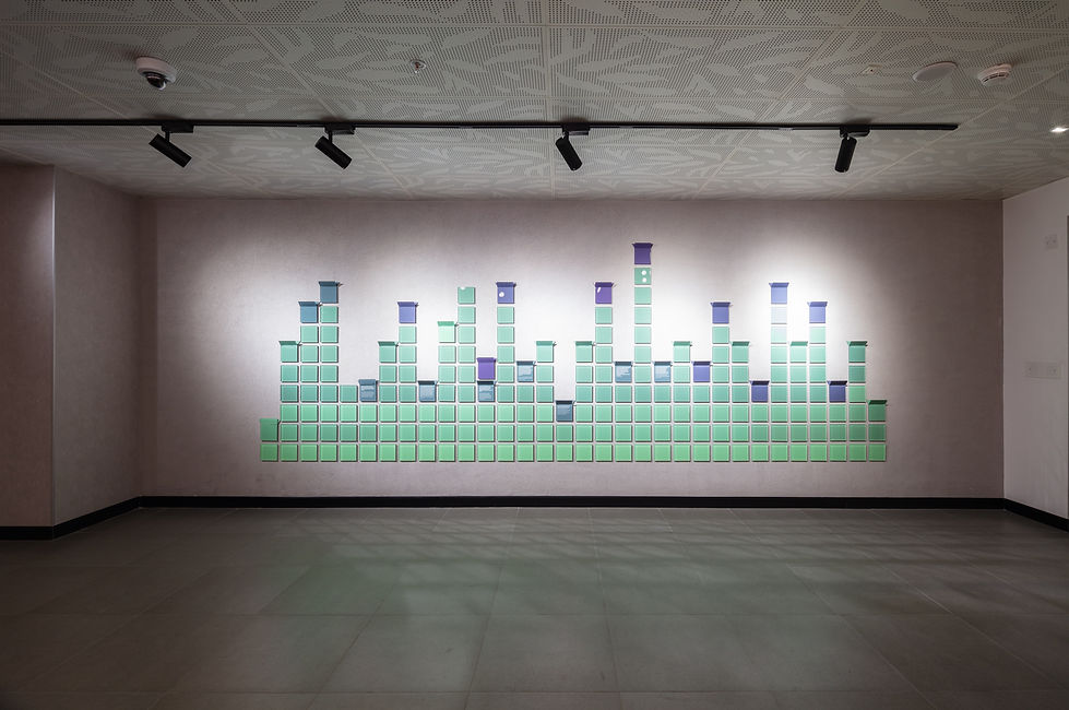
Acrylic and vinyl delivery boxes made for the Musician's themed floor on the lines of musical beats.